Why Good UI Is Invisible but Bad UI Is Unforgettable
The design of User Interface (UI) is evaluated on visual appeal, yet its real success is in the case when the users feel that it is not there. When a well-designed UI is provided, people would rarely consider it, but instead, think about buttons, layouts, and navigation. They just get their objectives easily. Conversely, in the case of a failure in UI design, it cannot be overlooked. Inconsistent designs, ambiguity of use, and aggravating experiences remain in the minds of the users even after the product has been exited. That is why a good UI will be transparent, whereas a bad one will be memorable.
The Nature of Invisible Design
Good UI is something that runs in the background. It can lead users through the process without causing one to become focused. When users interact with an application or a web page of a well-designed UI, they do not comment, this button is in the right place or this spacing is amazing. Rather, they affirm, this was user-friendly. The reaction is the best thing that can be given as a compliment to a designer.
Invisible UI reduces brainwork. Users do not need to think about the next thing to click or the way to accomplish a task. The eye is subtly directed through visual hierarchy, use of spacing, typography , and choice of color. The interface is easily recognizable, predictable, and intuitive. This means that users remain on their task, as opposed to the interface.
In this regard, good UI acts like good typography in a book. Well-done typography makes the reader concentrate on the story and not the font. However, typography, when poorly done, interferes with the reading process. The same thing happens to UI design.
Three Reasons Why Bad UI Makes a Memorable Impact
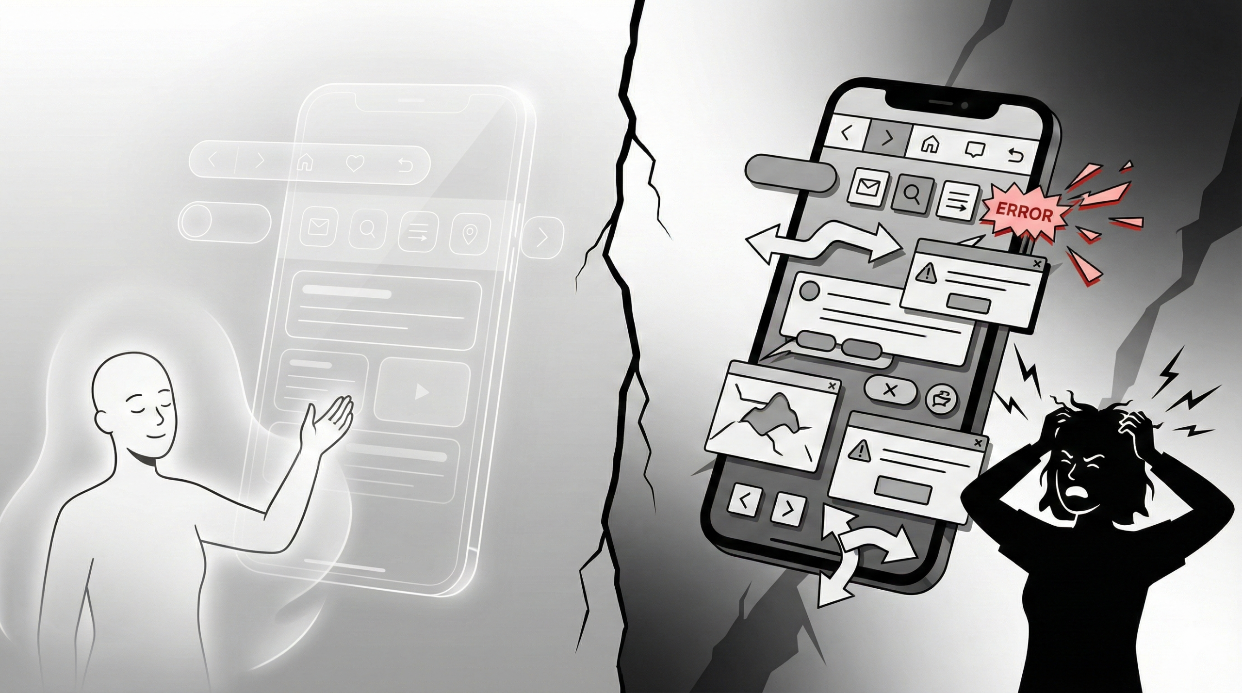
Bad UI interrupts user flow. It makes users take breaks, make guesses, and fix up. It is friction brought about by these interruptions, and frustration comes with frustration. The brains of human beings have been designed to remember unpleasant experiences more than pleasant ones. That is why one bad interaction can be used to destroy a series of good interactions.
The absence of clarity, variations in the use of the same navigation, lack of contrast, or slow feedback prompts a feeling of being lost or powerless in the users. Lack of knowledge by the users on what is being done makes them attribute the blame to the product and even the brand itself. It is not just that a bad UI does not work visually, but it also impairs trust.
Indicatively, when a button appears to be a clickable object but does not work, or when an error notification does not include an explanation of the failure, users feel lost and frustrated. These instances remain in memory because they are against expectations. Poor UI is something that must be brought to attention through the worst means.
UI is Not Decoration, but Behavior
A misconception is that the design of UIs is concerned with making things look nice. Although aesthetics is important, UI concerns behavior mostly. It is concerned with forecasting the way users will engage a system and make it designable.
Good UI foresees the needs of the users. It provides answers even before they are asked by the users. It gives feedback at appropriate times and eliminates redundant decisions. In cases where UI corresponds with user behavior, interactions are natural and effortless.
Bad UI, in contrast, tends to focus more on the visual trends than usability. Echo-filled animations or low contrast text, elaborate layouts can be stunning in mock-ups, but not in practice. A bad design solution, which disregards human behavior, causes users trouble – and they do not forget it.
It is the Structure that Builds Convenience
Consistency is one of the major reasons why good UI is not obvious. People get in the habit of creating mental models pretty fast when buttons work similarly in multiple screens, when icons have patterns that people are used to, and when layouts do not suddenly switch.
Familiarity saves on learning time. Users do not require instructions since the interface instructs them through repetition. This acquaintance causes comfort and confidence.
Unstable MI disfigures that confidence. Users get confused when they make the same movements with different outcomes, or when their computer can change direction without any apparent reason. Such ambiguity causes the interface to stand out, which is not a positive aspect.
The Effect of Micro-Interactions
Micro-interactions are tiny reactions that can recognize user actions: indicators loading, hover effects, success messages, or minor animations. When properly done, they will give assurance to the users that the system is operational.
Good micro interactions are hardly perceived, but felt deeply. They decrease anxiety and enhance confidence. Users feel in control.
Users are made to feel ignored when there are no or when they are performed poorly. There is doubt when clicking on a button that lacks feedback. Did it work? Should I click again? These minor uncertainty incidences add into an unpleasant product recollection.
Invisible Inclusion and Accessibility
Another factor that makes good UI invisible is the issue of accessibility. When the interfaces are made available, all users, regardless of ability, can interact without hindrances. The legible fonts, well contrasted, logic, and keyboard-friendly navigation silently contribute towards inclusiveness.
Inaccessibility leads to a frictional experience for the affected users. Bad UI to them is not an annoyance; it is not an exclusion. Such frustrating experiences are never forgotten, and they can make users drop the product completely.
Creating user-friendly UI is beneficial, not only to a particular population. It simplifies interfaces and makes them easier to use and more human.
Feeling and Confidence in UI Design
UI design has an effect on user emotions. Good UI is trustworthy, sincere, and appreciates the time of users. It does not shock the user with any suddenly appearing behavior or movements.
Bad UI creates anxiety. Unforeseen pop-ups, ambiguity of the permission or otherwise, and actions that cannot be undone without verification put users in an insecure position. After the breakdown of trust, users are reluctant to come back.
Feeling is a very dominant component in memorization. The experience of calmness and softness shifts to the background, and frustration proves to be an unforgettable one.
Invisible UI Is Intentional
Invisible UI does not occur as an accident. The outcome of choices, experimentation, trial, and sympathy has been achieved. Designers have to fully comprehend user objectives, agonies, and situations.
Each attempt to separate, select certain colors, and interaction pattern will add its own effects to the general experience. The most skilled designers are those who design sparingly – not adding on to their designs, but simply what is essential.
Good UI requires humility. The designers should be prepared to learn that their success levels are high, and they need not be noticed.
Conclusion
Good UI is not visible as it adapts to the user. It eliminates the barriers, lowers reasoning, and helps achieve aspirations uninterruptedly. Users do not recall an interface, but they recall an experience.
Bad UI, though, must be focused on frustration and confusion. It disrupts continuity, distrusts, and creates a bad impression that becomes unforgettable.
Eventually, UI design is not the way to impress users with images, but rather the way to make a user empowered with the help of simplicity. With the loss of UI, the experience glosses. And that is the real indication of a great design.