The Anatomy of a Great Landing Page.
The Anatomy of a Great Landing Page.
Most landing pages don’t fail because of bad design. They fail because of bad structure. Every section has a job to do. When one section is weak, the whole page leaks.
Here’s what a great landing page is actually made of.
The Hero Section This is your first impression. One clear headline. One supporting line. One action. The visitor should know within three seconds exactly what this page is offering and why it matters to them. If they have to think, you’ve already lost them.
The Problem Statement Before you sell the solution, name the pain. When a visitor reads this section and thinks “that’s exactly my situation”, trust begins. This section is often skipped. It shouldn’t be.
The Solution Now you introduce what you offer. Keep it simple. Not a feature list. A clear answer to the problem you just named. One idea. Said plainly.
Social Proof Reviews, numbers, logos, case studies. People don’t trust claims. They trust other people. Put your strongest proof here, not at the bottom where no one reaches.
The Benefits Section Not features. Benefits. Features tell people what it does. Benefits tell people what changes for them. That difference matters more than most people realize.
The CTA One ask. One button. One direction. The biggest landing page mistake is giving visitors too many options. Confusion kills conversion.
The Closer A final nudge. Address the last hesitation. Remind them what they’re getting. Sometimes one honest line here does more work than the entire page above it.
A great landing page isn’t long or short. It’s complete. Every section earns its place or it goes.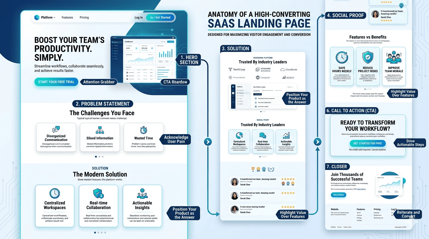

Completely agree. One thing I’d add is that structure only works when it’s built around a deep understanding of the audience.
A perfectly structured landing page can still underperform if the messaging doesn’t match what visitors actually care about. The best pages don’t just follow a framework they answer the exact questions running through a prospect’s mind at each stage.
Structure creates the path. Messaging creates the momentum.
When both are aligned, conversions happen naturally.