Why Fonts Have Feelings Too: Emotional Impact of Typography in Web Design

Why Fonts Have Feelings Too: Emotional Impact of Typography in Web Design
We don’t choose fonts just to make things easy when creating a website. Fonts do speak directly; they set the mood, show off the brand’s personality, and give the audience a vibe about the site before they even read a single word.
Why Typography Matters on Websites
People notice fonts as one of the first things, even without realizing it. Typography actually gives them a certain feeling, sort of like a first impression. A great font choice can make your site feel trustworthy and fun, while everything is portrayed in good quality. A not-so-great one, on the other hand, might feel off, confusing, or even a little sketchy.
How Fonts Influence Emotion and Brand Vibe
Let’s break it down with some examples :
Professional vs. Playful
A clean sans-serif font makes a business site feel polished and modern. But for a cozy bakery? A cute, hand-drawn script font can give off warmth and charm, like you’re walking into a little café.
Luxury vs. Minimalist
You could choose classic serif fonts in gold or deep tones to give a luxurious vibe. Whereas, for something clean and fresh, you might try thin, lowercase sans-serif fonts with lots of white space, which will actually look lighter and more modern too.
Trust vs. Innovation
Finance and law websites usually go with bold, solid fonts to show stability and trust. But a tech startup? They might lean into sleek, geometric, or custom fonts to look innovative and cool.
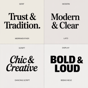
Fonts and the Feelings They Bring
Here’s a quick review:
Serif fonts (like Georgia, Merriweather)
Feel: Traditional, elegant, reliable
Commonly used by: Law firms, editorial sites, luxury brands
Sans-serif fonts (like Open Sans, Lato, Helvetica)
Feel: Clean, modern, approachable
Seen on: Startups, SaaS platforms, portfolios
Script fonts (like Dancing Script, Pacifico)
Feel: Personal, creative, stylish
Perfect for: Lifestyle brands, small biz websites
Display fonts (like Bebas Neue, Playfair Display)
Feel: Bold, dramatic, attention-grabbing
Best for: Headlines, hero sections, banners
Real Website Examples: How Typography Plays Out
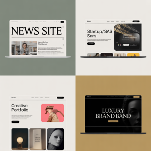
News Websites – Serif typefaces are typically used in articles to convey credibility and seriousness.
Online Retailers Require fonts that are incredibly readable and user-friendly, particularly when customers are checking out.
Creative Portfolios – Designers and artists often use fashionable or unusual fonts to showcase their individuality.
Corporate Websites – They use simple, professional fonts to demonstrate their expertise and tone.
Next time, ask yourself: What do I want people to feel when they view my site?
Because in web design, typography doesn’t just talk, it makes you feel.